How to Pick Luxury Marble Wallpaper That Reads Expensive on a Wall
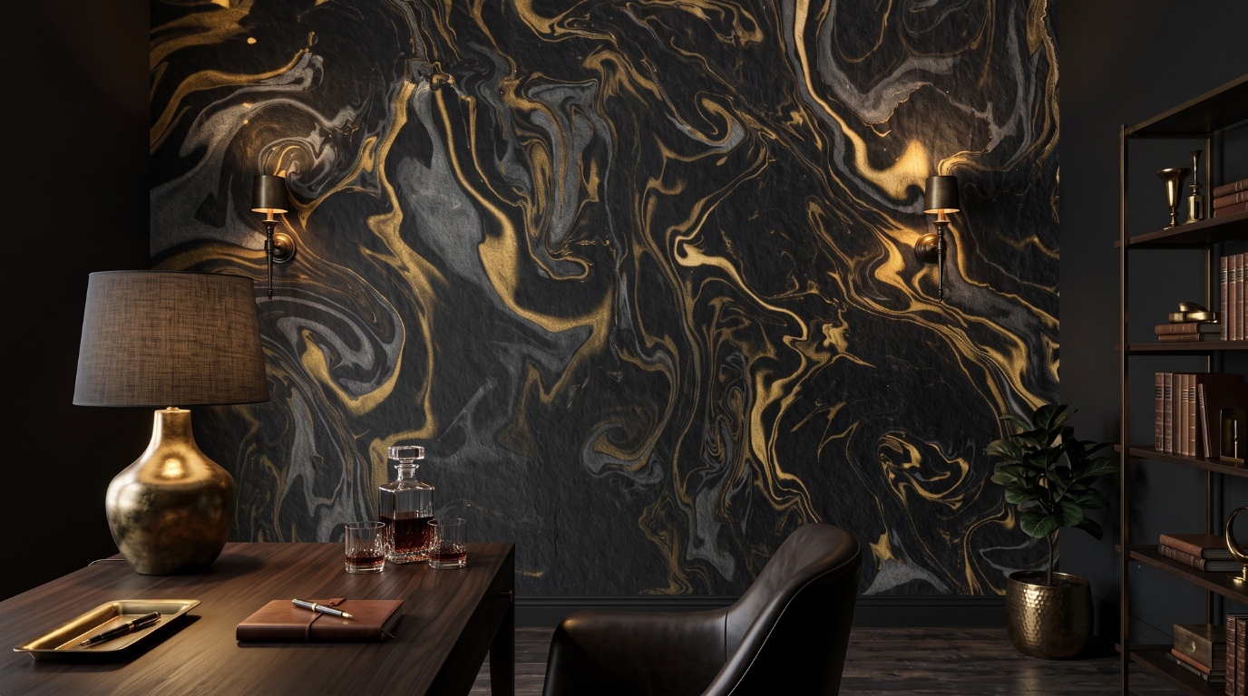
Two marble prints can cost the same, hang on the same wall, and land completely differently. One looks like stone. The other looks like a photograph of stone. The gap is rarely the design itself. It comes down to four checks you can run before you order: vein scale, base tone, metallic accent and surface finish.
Marble wallpaper reads expensive when the veining sits at a scale quarried stone would sit at on that wall, the base tone suits the light the room already has, metal appears as an accent rather than structure, and the surface stays low in sheen. Check the room first, the design last.
How do you judge vein scale before you order?

Judge vein scale against a fixed reference in the product image, such as a sofa arm or a door frame. That reference tells you how wide each vein lands at wall size, and vein width is what your eye reacts to once the print is up.
Made to measure printing means you are choosing how much a design gets scaled to reach your dimensions, not only the design. A broad wall stretches everything until the veins sit wider than any slab is ever cut. A narrow wall compresses it, which is why busier veining holds up on a chimney breast and fails across a long living room wall. Knowing whether you are looking at a repeating design or one large image matters here too, since marble print wallpaper behaves differently once it is pulled wide.
The error I see most is choosing at thumbnail size. Thumbnails flatter busy veining and punish subtle veining, so the shortlist that feels exciting on a phone is often the wrong shortlist for the room.
Vein scale is the one variable no styling fixes after installation.
Base tone does more work than the veining

The base tone is the field the veins sit on, and it decides how the wall behaves across a whole day. Chalk white, cream, sand, ash and charcoal each respond differently to the light a room already has, long before anyone looks closely at the veining.
Cool bases go dull under warm bulbs or weak daylight. The blue sitting under a cool white print has nothing to bounce off, so the wall reads muted rather than crisp. Warm bases carry both without losing depth, which is why cream and sand prints survive more rooms than pure white ones do. Filtering the luxury marble wallpaper range by base tone before you look at veining keeps the shortlist honest.
Veining is what you notice in a photograph. Base tone is what you notice after a week of living with the wall. Choosing on veining alone is choosing for the photo rather than the room.
Where metallic accents help and where they hurt
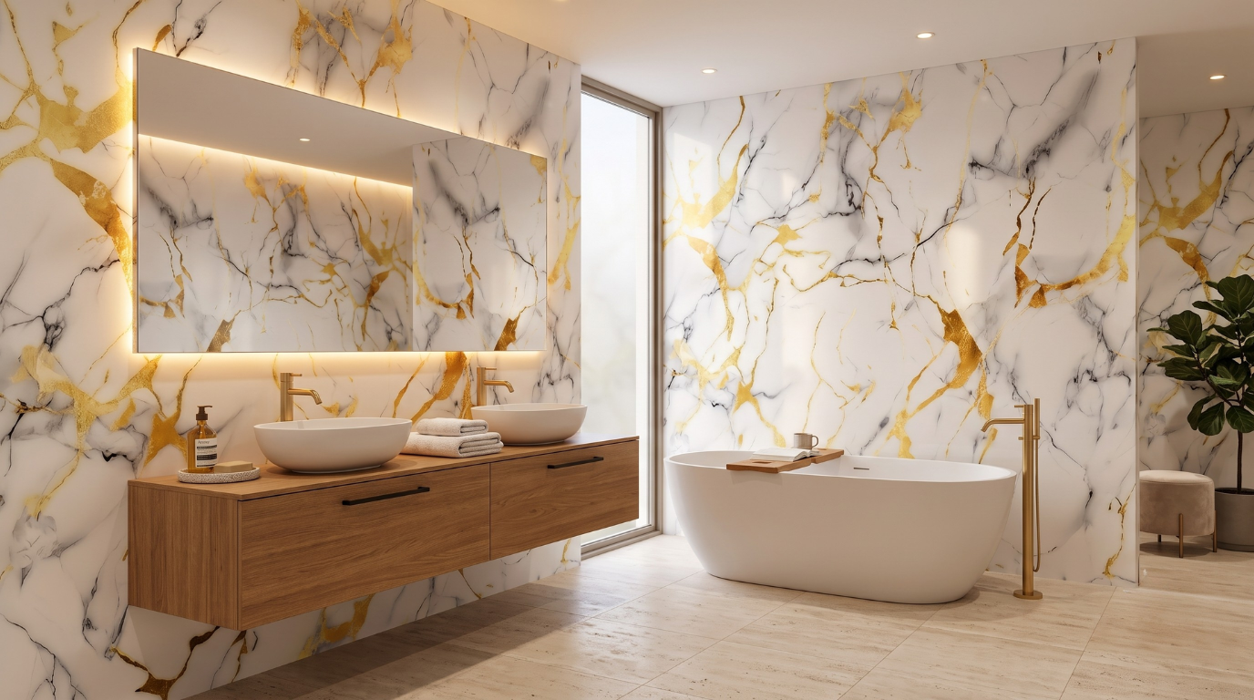
Match the base tone to the light you actually have and the veining looks better by default.
Metallic flecking in gold, rose or silver helps when it sits as an accent inside the design and hurts when it carries the structure of the design. That distinction separates a wall that looks quarried from one that looks decorative.
Metal works best on warm bases, on walls broken up by furniture or a fireplace, and in rooms with more than one light source. Layered light hits the flecking from different angles so it glints in places rather than lighting up in a sheet. It works least well on a large uninterrupted wall lit by one overhead fitting, where the metallic content catches as a single bright band.
If the metal is doing the heavy lifting, the wall reads as ornament. If the stone is doing the work and metal appears only where a vein turns, the wall reads as material.
Does the finish change how the print reads under light?

Finish changes the read more than most buyers expect. Low sheen surfaces absorb light and sit close to honed stone, the finish most high end interiors specify. Higher sheen surfaces bounce light back and make the flatness of a printed surface visible.
Side light is the harshest test. A wall running alongside a window shows every reflection difference along its length, so sheen reveals itself as paper at the point you look longest. Walls facing a window, or lit softly from above, forgive more. Picking a surface across the marble wallpaper range that matches the finish you would have specified in real stone keeps the print from competing with what people already know stone looks like.
Quiet surfaces read costly. Reflective surfaces read printed.
How do you put the four checks together before ordering?

Run them in order: base tone against room light, vein scale against wall width, metallic accent as a yes or no, then finish against light direction. That sequence stops you falling for a design you were never going to make work in that room.
Most people run it backwards. They start from the design, commit, then reason past a base tone that fights the room. The checks stop being filters and start being excuses.
Start from the room and finish with the design. The shortlist that survives will be short, and that is the point.
FAQs
What makes marble wallpaper look cheap on a wall?
Scale is the usual cause. Veining stretched wider than any real slab, or shrunk until it repeats visibly, tells the eye it is looking at a print. Sheen is the second, since reflective surfaces reveal flatness under side light. Design choice is rarely the problem.
Does vein scale need to match the size of the wall?
Yes, and it is the check worth running straight after base tone. Broad walls need long vein runs that survive being pulled wide. Narrow walls handle denser veining well. Judging against a fixed reference in the product image beats judging by eye.
Is a low sheen finish more expensive looking than a glossy one?
Generally yes. Low sheen sits closer to honed stone, the finish specified in most high end interiors, and it hides the flatness of a printed surface. Higher sheen bounces light and draws attention to the wall being paper rather than stone.
Can gold veining work without the wall looking loud?
It can, provided the metal stays an accent rather than the structure of the design. Gold appearing only where a vein turns reads as material. Gold forming the pattern reads as ornament. Layered lighting helps, since one overhead fitting makes the flecking catch in a single band.